Other Component
Navigation
Related Links: How to Add a Component | How to Modify a Component | Editing Basics | Working with ButtonsOverview | Edit Menu | Navigation Component Menu Style
Overview
To add a menu navigation for all of your pages, you would use a Navigation component.

Click on "Page" in the top-left corner of the Page Editor. Click on "Other". Click on "Navigation".
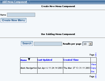
When you add the Navigation component, you will have the following screen:
Back to the Top of the Page
Edit Menu
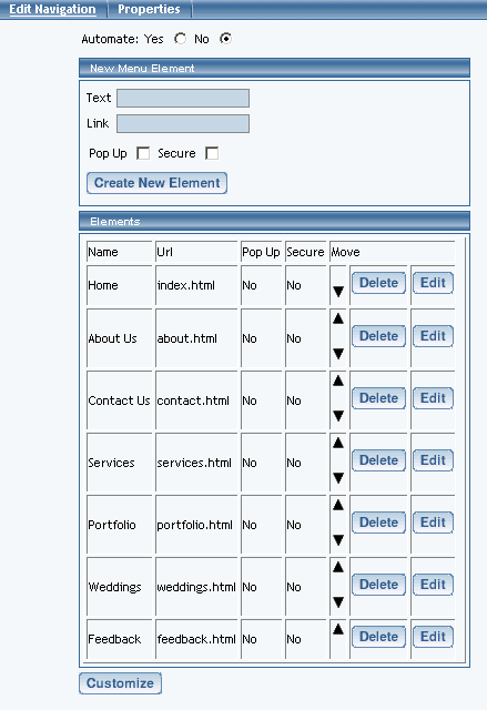
If you want the Page Editor to automate the process of the menu navigation, click on the radio button next to the text "Yes". The Page Editor will generate links to all of active pages that have a Menu Name assigned.

If you select "No" to automate the menu navigation, you will have to define each menu listing. Enter the text you want to display on the Web site in the field "Text", the page you want to link to in the field "Link", and specify whether you want the link to open the page in a new window. If you want to secure the links to the new page, click on the checkbox "Secure". When done specifying your new menu listing, click on the button "Create New Element". Once you have menu listings, you can modify them, move up or down (using the up and down black arrows), and delete the menu listing.
Back to the Top of the Page
Navigation Component Menu Style
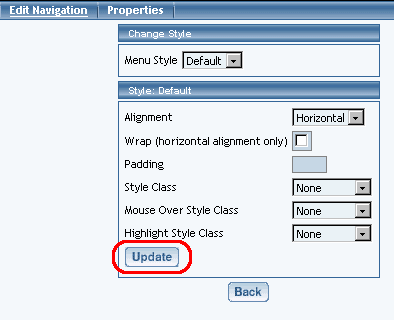
To customize the settings for your Navigation component, click on the button "Customize". Select a Menu Style in the drop-down menu at the top of the window. You have options to select "Default", "Image" and "3Image". Once you have chosen a Menu Style, click on the button "Update" to see additional options.
Default menu Style
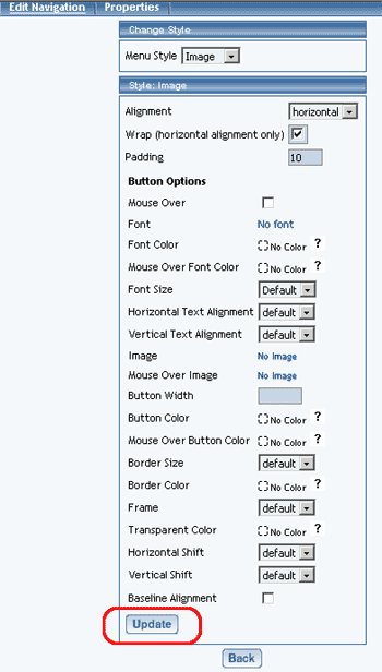
Image Menu Style
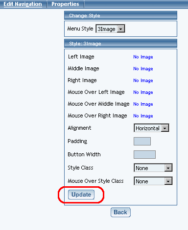
3Image Menu Style
Back to the Top of the Page
-
Default
Alignment – specify whether you want your navigation menu to be aligned horizontally or vertically.
Wrap – if you specified a horizontal alignment, you can specify whether you want the Administration to wrap the navigation menu when the menu exceeds the width of the page.
Padding – specify whether there will be extra spacing on all four sides of the Navigation component. The padding will be measured in pixels.
Style class, mouse-over style class, and highlight style class give you the ability to designate the style sheet classes that will apply to the Navigation component.
When you are done specifying all of your options for your Menu Style, click on the button "Update" to save your changes to the Navigation Component.
Back to Navigation Component Menu Style
Back to the Top of the Page
Image
Alignment – specify whether you want your navigation menu to be aligned horizontally or vertically.
Wrap – if you specified a horizontal alignment, you can specify whether you want the Administration to wrap the navigation menu when the menu exceeds the width of the page.
Padding – specify whether there will be extra spacing on all four sides of the Navigation component. The padding will be measured in pixels.
Mouse Over – specify whether you want to have the menu navigation text to change color when the mouse pointer moves over the buttons.
Font – specify the font face for the text on the buttons.
Font Color – specify the font color of the text on buttons.
Mouse Over Font Color – if you have specified to use a mouse-over on the menu, you can specify the font color of the navigation menu when the mouse pointer moves over the button.
Font Size – specify the size of the font for the text on the buttons.
Text Alignment – specify the alignment of the text on the buttons.
Image - click on the blue text "No Image" to specify the image file to be used
Mouse Over Image - click on the blue text "No Image" to specify the image file to be used
Button Width – specify the width of the buttons. You can only specify the button width if you are not using an image.
Button Color - specify a button color if you are not using an image for the button.
Mouse Over Button Color – specify the mouse-over button color if you are not using an image for the button.
Transparent Color - specify the color of the button that you would like to have transparent. Whatever color that you select for this field "Transparent Color" will be made transparent by the navigation component.
Horizontal Shift - specify the number of pixels, beginning from the left of the button, that you want to start the text on the button. Text alignment must also be set to "left".
Vertical Shift - specify the number of pixels, beginning from the top of the button, that you move the text on the button down. Text alignment must also be set to "left".
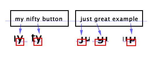
Baseline Alignment - by default, the baseline alignment is turned off. As such, buttons with lowercase Y, lower case G, lowercase J, lower case Q, lowercase P, and lowercase Y will appear like so:

When you are done specifying all of your options for your Menu Style, click on the button "Update" to save your changes to the Navigation Component.
Back to Navigation Component Menu Style
Back to the Top of the Page
3Image
Left Image, Middle Image, and Right Image fields give you the ability to specify the left, middle, and right portions of the button. All three images will be combined by the system to create the button.
Mouse Over Left Image, Mouse Over Middle Image, and Mouse Over Right Image fields give you the ability to specify the left, middle, and right portions of the button. All three images will be combined by the system to create the Mouse Over effect for the button when a mouse pointer moves over the button.
Alignment – specify whether you want your navigation menu to be aligned horizontally or vertically.
Wrap – if you specified a horizontal alignment, you can specify whether you want the Administration to wrap the navigation menu when the menu exceeds the width of the page.
Button Width – specify the width of the buttons.
Style Class and Mouse Over Style Class give you the ability to specify Style sheet Classes to the buttons.
When you are done specifying all of your options for your Menu Style, click on the button "Update" to save your changes to the Navigation Component.
Editing Basics
Back